from moodswing import (
    DictionarySentimentAnalyzer,
    Sentencizer,
    DCTTransform,
    prepare_trajectory,
    plot_trajectory,
    trajectory_to_dataframe,
)
from moodswing.data import load_sample_text
import matplotlib.pyplot as plt
import numpy as np
import pandas as pd

# Load a sample text
doc_id, text = load_sample_text("portrait_artist")
sentencizer = Sentencizer()
analyzer = DictionarySentimentAnalyzer()

# Prepare trajectory
sentences = sentencizer.split(text)
scores = analyzer.sentence_scores(sentences, method="syuzhet")
trajectory = prepare_trajectory(
    scores,
    rolling_window=int(len(scores) * 0.05),
    dct_transform=DCTTransform(low_pass_size=5, output_length=100, scale_range=True)
)Visualization Guide
This guide demonstrates advanced visualization techniques for sentiment trajectories, from customizing the built-in plot_trajectory() function to creating fully custom plots with seaborn, plotly, and matplotlib.
Setup
Controlling component visibility
The components parameter lets you show only specific trajectory lines, reducing visual clutter:
fig, ax = plt.subplots(figsize=(10, 4), dpi=150)
plot_trajectory(trajectory, components=["dct"], title="Clean Narrative Arc", ax=ax)
plt.show()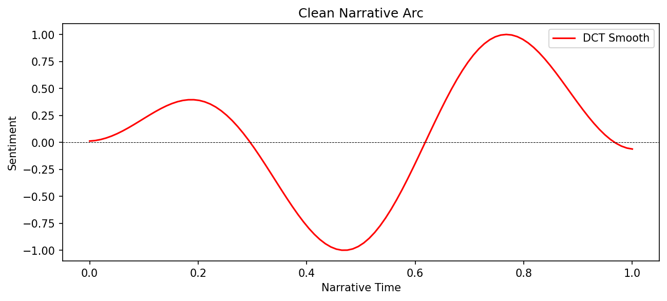
fig, ax = plt.subplots(figsize=(10, 4), dpi=150)
plot_trajectory(
    trajectory,
    components=["rolling", "dct"],
    title="Smoothing Comparison",
    ax=ax
)
plt.show()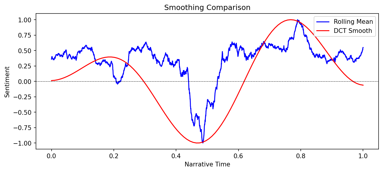
Custom colors and styling
Use the colors parameter to match your publication or presentation style:
fig, ax = plt.subplots(figsize=(10, 4), dpi=150)
plot_trajectory(
    trajectory,
    colors={
        "raw": "#CCCCCC",      # Light gray
        "rolling": "#2E86AB",  # Ocean blue
        "dct": "#A23B72"       # Magenta
    },
    title="Custom Color Palette",
    ax=ax
)
plt.show()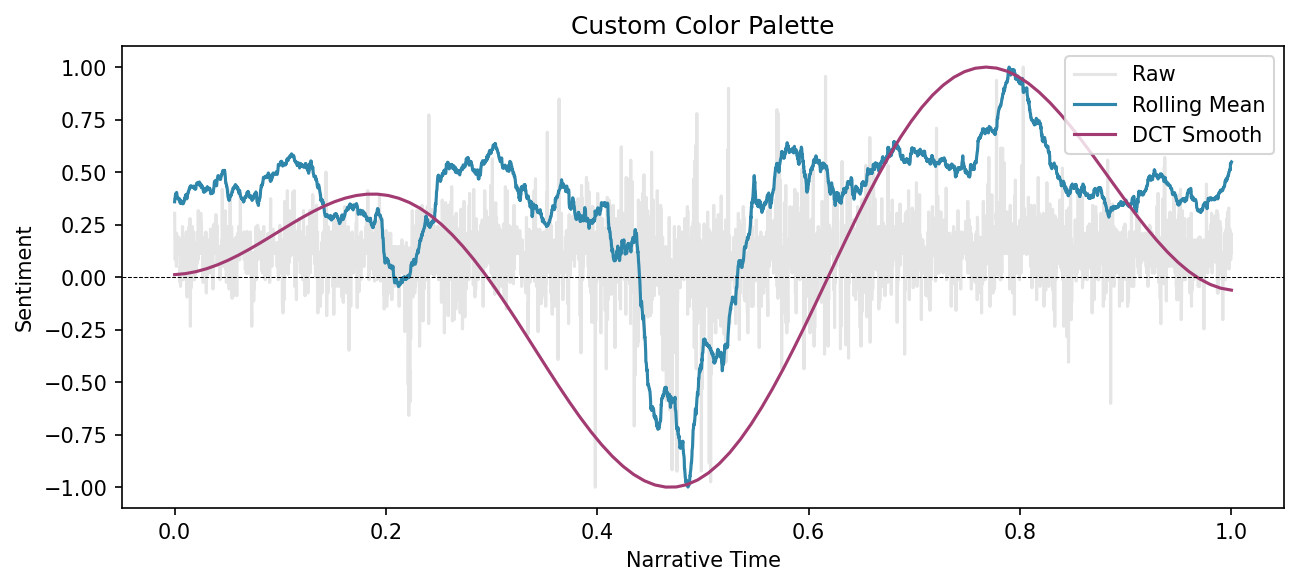
Custom figure size and DPI
Control output dimensions by creating your own figure before calling plot_trajectory():
# Create figure with specific dimensions
fig, ax = plt.subplots(figsize=(12, 3), dpi=200)

plot_trajectory(
    trajectory,
    components=["dct"],
    title=f"{doc_id}: High-Resolution Arc",
    ax=ax
)

# Additional customization
ax.set_facecolor('#F8F8F8')
plt.tight_layout()
plt.show()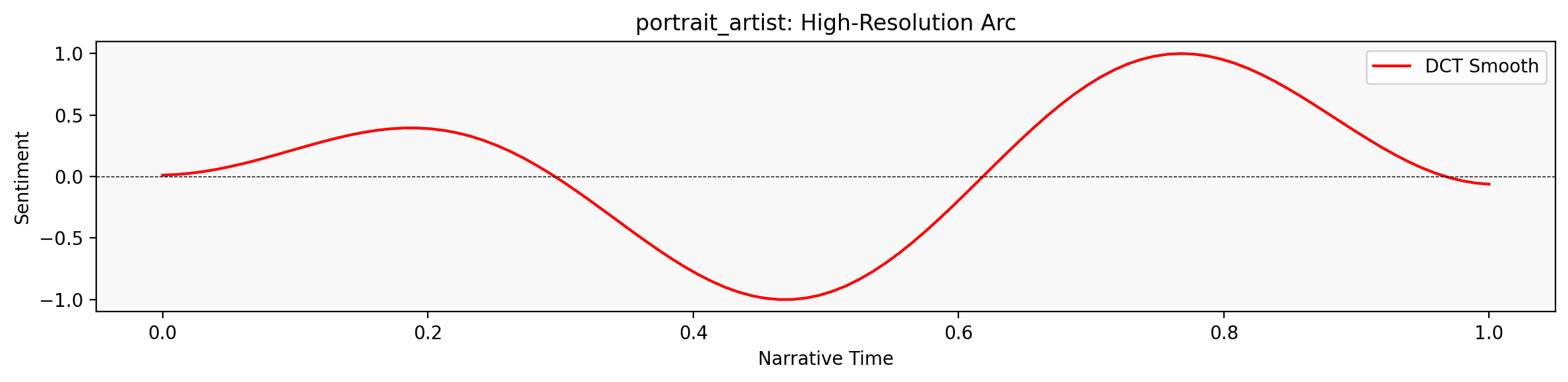
Using seaborn
For statistical graphics and modern aesthetics, convert to a DataFrame and use seaborn:
import seaborn as sns

# Convert to DataFrame
df = trajectory_to_dataframe(trajectory)

# Create seaborn plot
fig, ax = plt.subplots(figsize=(10, 4), dpi=150)
sns.lineplot(
    data=df,
    x='position',
    y='value',
    hue='component',
    style='component',
    markers=False,
    palette=['lightgray', 'steelblue', 'crimson'],
    linewidth=2,
    ax=ax
)

ax.axhline(0, color='black', linewidth=0.5, linestyle='--', alpha=0.3)
ax.set_xlabel('Narrative Position')
ax.set_ylabel('Sentiment')
ax.set_title(f'{doc_id}: Seaborn Styling')
ax.legend(title='Component', frameon=False)
plt.tight_layout()
plt.show()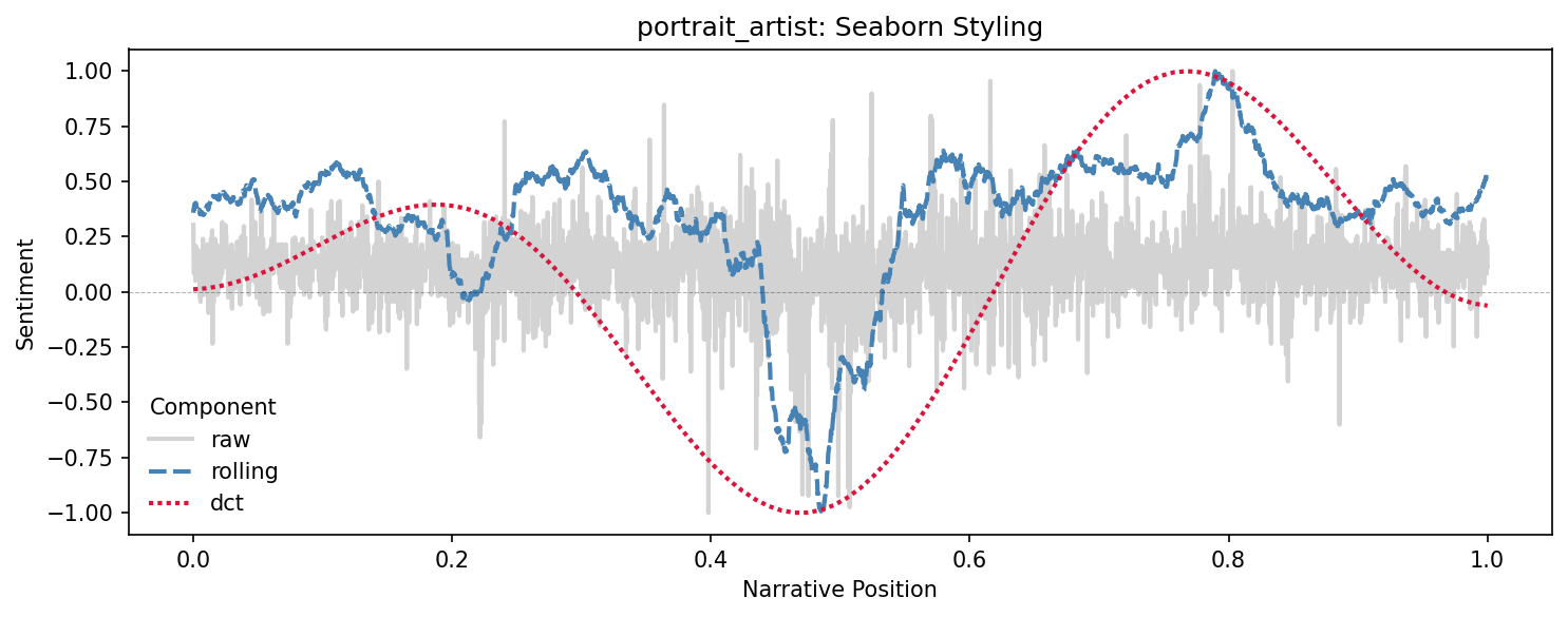
Interactive plots with plotly
For web-ready interactive visualizations, use plotly with the DataFrame:
import plotly.express as px

# Filter to smoothed components only
df_smooth = df[df['component'].isin(['rolling', 'dct'])]

# Create interactive plot
fig = px.line(
    df_smooth,
    x='position',
    y='value',
    color='component',
    labels={'position': 'Narrative Position', 'value': 'Sentiment', 'component': 'Method'},
    title=f'{doc_id}: Interactive Sentiment Trajectory'
)

fig.add_hline(y=0, line_dash='dash', line_color='gray', opacity=0.5)
fig.update_layout(
    hovermode='x unified',
    template='plotly_white',
    height=400
)

fig.show()
The interactive plot allows you to:
- Hover to see exact values
- Zoom and pan
- Toggle components on/off by clicking the legend
- Export as PNG or SVG
Plotting NRC emotion trajectories
Track multiple emotions across the narrative using NRC data:
# Get NRC emotions
emotions_list = analyzer.nrc_emotions(sentences)
emotions_df = pd.DataFrame(emotions_list)

# Select emotions to plot
emotions_to_plot = ['joy', 'fear', 'anger', 'trust', 'sadness']
positions = np.linspace(0, 1, len(emotions_df))

# Create plot
fig, ax = plt.subplots(figsize=(12, 5), dpi=150)

colors_map = {
    'joy': 'gold',
    'fear': 'purple',
    'anger': 'red',
    'trust': 'green',
    'sadness': 'blue'
}

for emotion in emotions_to_plot:
    # Apply smoothing to each emotion
    from moodswing.transforms import rolling_mean
    smoothed = rolling_mean(emotions_df[emotion].values, window=int(len(sentences) * 0.05))
    ax.plot(positions[:len(smoothed)], smoothed, label=emotion.title(),
            color=colors_map[emotion], linewidth=2, alpha=0.8)

ax.set_xlabel('Narrative Position', fontsize=12)
ax.set_ylabel('Emotion Intensity', fontsize=12)
ax.set_title(f'{doc_id}: Emotional Landscape', fontsize=14, fontweight='bold')
ax.legend(loc='upper right', frameon=True, fancybox=True, shadow=True)
ax.grid(True, alpha=0.2)
plt.tight_layout()
plt.show()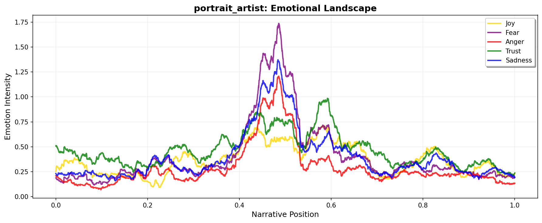
Comparing multiple texts
Overlay trajectories from different novels to compare narrative structures:
# Load and process multiple texts
texts_to_compare = [
    ("portrait_artist", "Portrait of the Artist"),
    ("madame_bovary", "Madame Bovary"),
    ("ragged_dick", "Ragged Dick")
]

fig, ax = plt.subplots(figsize=(12, 5), dpi=150)
colors_novels = ['#E63946', '#457B9D', '#2A9D8F']

for idx, (text_id, label) in enumerate(texts_to_compare):
    try:
        _, novel_text = load_sample_text(text_id)
        novel_sents = sentencizer.split(novel_text)
        novel_scores = analyzer.sentence_scores(novel_sents, method="syuzhet")

        # Create DCT transform with consistent output length
        novel_traj = prepare_trajectory(
            novel_scores,
            dct_transform=DCTTransform(low_pass_size=5, output_length=100, scale_range=True),
            normalize='range'
        )

        # Plot only DCT
        x = np.linspace(0, 1, len(novel_traj.dct))
        ax.plot(x, novel_traj.dct, label=label, color=colors_novels[idx], linewidth=2.5, alpha=0.8)
    except:
        print(f"Could not load {text_id}")

ax.axhline(0, color='black', linewidth=0.5, linestyle='--', alpha=0.3)
ax.set_xlabel('Normalized Narrative Position', fontsize=12)
ax.set_ylabel('Sentiment', fontsize=12)
ax.set_title('Comparing Narrative Arcs: Three Novels', fontsize=14, fontweight='bold')
ax.legend(loc='best', frameon=True, fancybox=True)
ax.grid(True, alpha=0.2)
plt.tight_layout()
plt.show()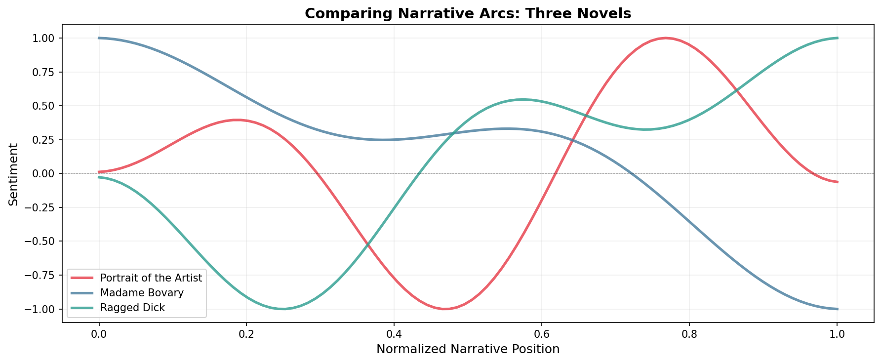
Faceted plots
Show multiple aspects of the same text in subplots:
# Create 3x1 subplot layout
fig, axes = plt.subplots(3, 1, figsize=(10, 8), dpi=150, sharex=True)

components_data = [
    ('raw', trajectory.raw, 'Raw Scores', 'gray'),
    ('rolling', trajectory.rolling, 'Rolling Mean', 'steelblue'),
    ('dct', trajectory.dct, 'DCT Smooth', 'crimson')
]

for ax, (comp_name, data, title, color) in zip(axes, components_data):
    x = np.linspace(0, 1, len(data))
    ax.plot(x, data, color=color, linewidth=2)
    ax.axhline(0, color='black', linewidth=0.5, linestyle='--', alpha=0.3)
    ax.set_ylabel('Sentiment', fontsize=10)
    ax.set_title(title, fontsize=11, fontweight='bold')
    ax.grid(True, alpha=0.2)

axes[-1].set_xlabel('Narrative Position', fontsize=11)
fig.suptitle(f'{doc_id}: Component Breakdown', fontsize=14, fontweight='bold', y=0.995)
plt.tight_layout()
plt.show()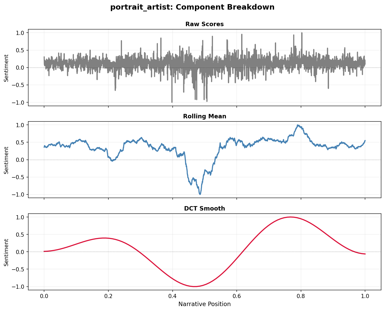
Exporting publication-ready figures
Save high-resolution figures for publication:
# Create publication-quality figure
fig, ax = plt.subplots(figsize=(8, 4), dpi=300)

plot_trajectory(
    trajectory,
    components=['dct'],
    colors={'dct': '#1A1A1A'},
    title='',  # No title for publication
    ax=ax
)

ax.set_xlabel('Narrative Position', fontsize=14, fontfamily='serif')
ax.set_ylabel('Sentiment', fontsize=14, fontfamily='serif')
ax.spines['top'].set_visible(False)
ax.spines['right'].set_visible(False)
ax.tick_params(labelsize=12)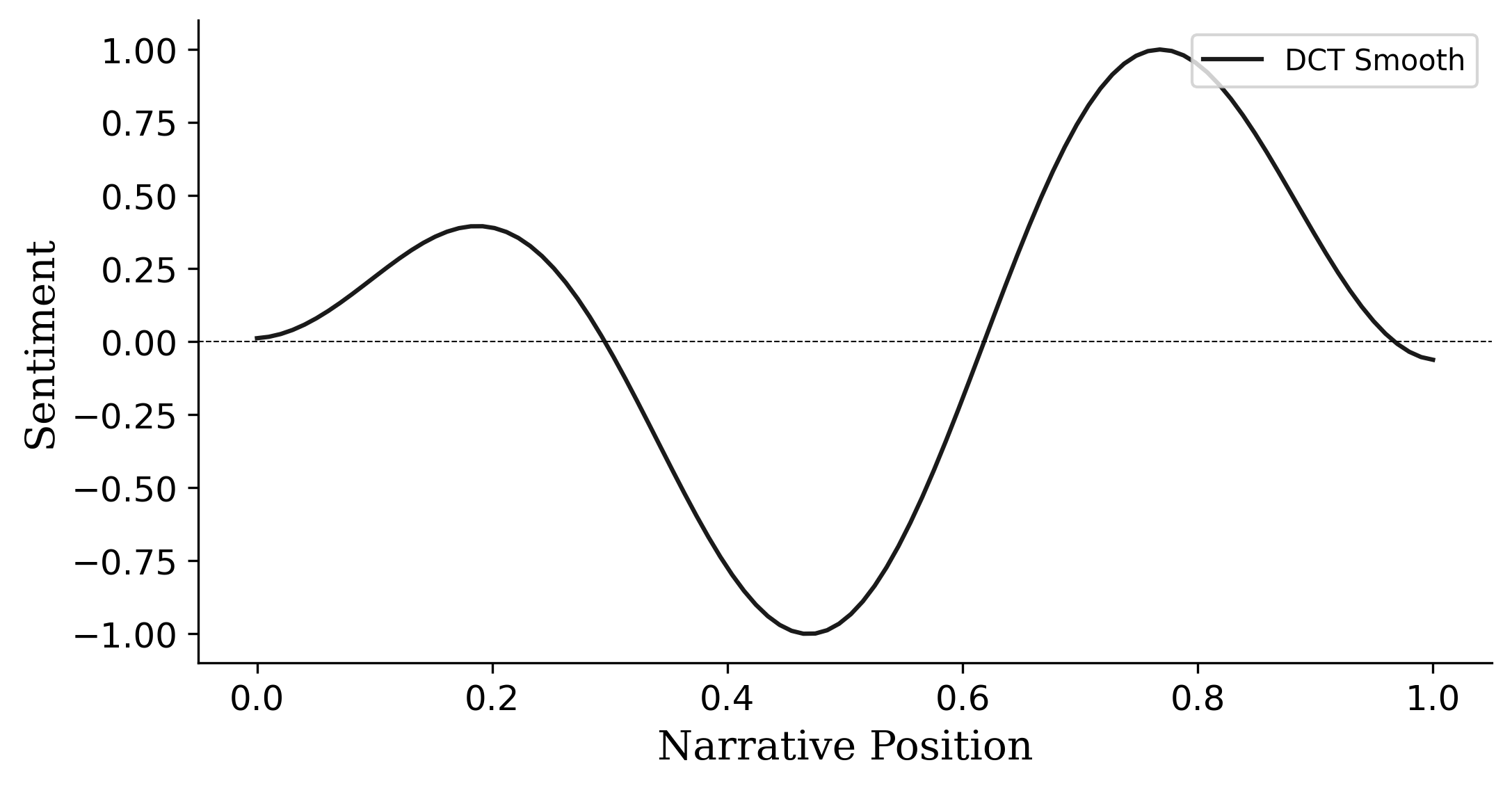
# Save in multiple formats
fig.savefig('sentiment_arc.png', dpi=300, bbox_inches='tight', facecolor='white')
fig.savefig('sentiment_arc.pdf', bbox_inches='tight')
fig.savefig('sentiment_arc.svg', bbox_inches='tight')

print("Saved as PNG (300 DPI), PDF, and SVG")
plt.close()
Next steps
- See the Examples Gallery for complete analysis workflows
- Explore Technical Notes for details on smoothing algorithms
- Check the API reference for all plotting parameters